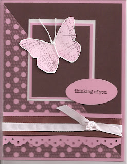
 The card above is a direct case (except sentiment changed) from Claudia Perry, a fellow demonstrator in Columbus, Georgia. See her card here. (Just click on the word "here" and it will take you there - scroll down as there are a couple of other "kissing" cards before you see this one. I decided to learn to do links!) The technique demonstrated is "Kissing." Appropriate for February, I thought! The butterfly is the piece on which that technique was used. (See directions below for how to kiss! : ) ) I learned about printing the designer series paper from My Digital Studio from reading her blog - it is from the Sweet Pea download - and printed on Pretty in Pink cardstock like she did. Other items used: Pretty in Pink cardstock and ink pad , Chocolate Chip cardstock and ink pad, white cardstock, chocolate chip 5/8" grosrain ribbon, Pretty in Pink 1/4" grosgrain ribbon (even though it looks white here, it is pink in real life), Butterfly Accent stamp, Sanded background stamp, kite string, eyelet border punch. I did change the sentiment and punched it out with wide oval punch. Both butterfly and large oval adhered with mini glue dots I believe. The sentiment is from Teeny Tiny Wishes - which is one of the best sentiment sets ever! I scanned the directions that I had at each station below each card, but I must have done something different than last time. They weren't readable. If you want the directions, please email me and I'll send you the Word document.
I also encouraged everyone to develop the habit of stamping "Hand Stamped By" on the back and putting their name or initials. I need to work on developing that habit too.

This card was created by juls716. I found it posted on splitcoaststampers on July 29, 2009. See her card here. I just loved the colors in this - especially the pastel chalks used on the peacock. The stamp is from the Very Thankful set on the inside back cover of the Stampin' Up! catalog - it is a Ronald McDonald stamp. In class the Bermuda Bay A2 card front piece was textured. (Mine pictured here is not textured - it is regular cardstock - because I wanted to save the textured for class use.) The pink grid piece is from the Razzleberry Lemonade pack of designer series paper. Then a Crushed Curry layer, and the Whisper White layer with the peacock adhered on top of that. The peacock was stamped in Versamark and then the chalks were added using sponge daubers. I tried q-tips first, thinking they would work better for the small areas - but actually the sponge daubers worked best. The Q-tips smudged the chalk more when I went to put it on the peacock. Sponge daubers daub better. Photo Corner punch also used.
The other things I learned are:
- Can see the Versamark better on the Whisper White cardstock
- Works better to do this in the daytime in good light (like under kitchen table light and with the window blinds open to let in natural light). Was a challenge to see the Versamark image the night before when I was using a different white cardstock and didn't have the better lighting.
 The above butterfly card is cased from cmstamps on splitcoast. She uploaded the card on December 14, 2009. See her card here. I did change the border punch - used the Scallop Trim border punch rather than the pinking hearts punch that she used.
 Products used, all Stampin'Up!: Whisper White cardstock, Bashful Blue cardstock, Pretty in Pink cardstock, Sage Shadow cardstock and ink pad. And from the Occasions Mini catalog (which lasts through April 30, 2010): Well Scripted stamp set for the sentiment, Scallop Trim border punch, Perfect Polka Dots embossing folder, Beautiful Wings embosslit die (punches out 5 butterflies and embosses them all at the same time).


